The Complete Guide to USM Haller Colors: Which One Suits Your Space?
Explore all 14 USM Haller colors from Pure White to Ruby Red. Learn which colors work best for different rooms and design styles.
Ready to design your own?
Use our free 3D configurator to build a USM-compatible modular unit — choose size, color, and panels.
Design your own USM-compatible unitMade to order. Delivery time varies by destination; duties and taxes are included under DDP.
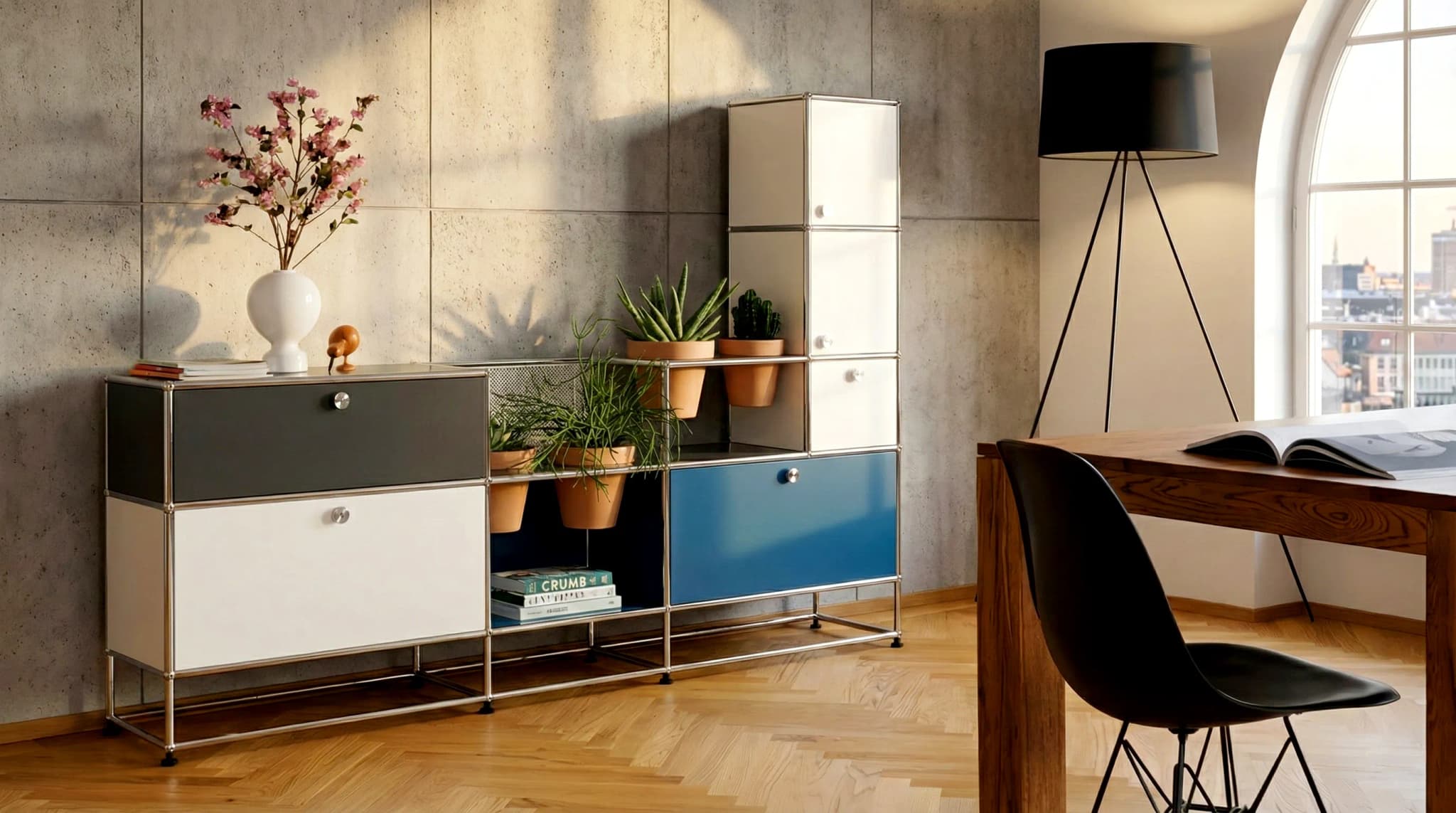
Color choice is one of the most personal aspects of furniture design. USM Haller — and compatible systems like Klackjoy — offer 14 iconic powder-coated colors. Nine carry an official RAL code (Pure White 9010, Light Grey 7035, Mid Grey 7005, Anthracite Grey 7016, Graphite Black 9011, Golden Yellow 1004, Pure Orange 2004, Steel Blue 5011, Gentian Blue 5010); the others are USM-proprietary shades named by colour only. Each has its own character and best-use scenarios. Let's explore them all.
The Neutral Palette
Pure White (RAL 9010)
Hex: #FFFFFF
The perennial bestseller. Pure white works everywhere and with everything. It brings light into spaces, recedes visually, and complements any interior style.
Best for:
- Small apartments (creates openness)
- Minimalist interiors
- Scandinavian decor
- Medical and dental offices
Light Grey (RAL 7035)
Hex: #D2D6D8
Slightly softer than white, light grey adds warmth while maintaining neutrality. Less prone to showing fingerprints than stark white.
Best for:
- Contemporary living rooms
- High-traffic family areas
- Modern corporate offices
Mid Grey (RAL 7005)
Hex: #A0A3A6
A sophisticated middle ground. Mid grey pairs beautifully with both warm wood tones and cool metallics.
Best for:
- Industrial-style lofts
- Executive offices
- Art galleries and studios
Anthracite Grey (RAL 7016)
Hex: #5E6669
Deep and dramatic without being as bold as black. Anthracite offers visual weight with subtlety.
Best for:
- Modern masculine interiors
- Home theaters
- High-end retail displays
Graphite Black (RAL 9011)
Hex: #373737
The statement maker. Black furniture commands attention and establishes a serious design presence.
Best for:
- Contemporary luxury homes
- Design studios
- High-end photography backdrops
- Music and recording studios
The Warm Colors
Golden Yellow (RAL 1004)
Hex: #F9B943
Sunshine bottled. This warm, optimistic yellow energizes any space.
Best for:
- Children's rooms and playrooms
- Creative studios
- Accent pieces in neutral rooms
- Scandinavian-style interiors
Pure Orange (RAL 2004)
Hex: #E56D29
Bold response. Orange demands attention and injects energy into any environment.
Best for:
- Modern living spaces
- Creative agencies
- Youth-oriented spaces
- Accent pieces
Ruby Red
Hex: ca. #AB2225 (USM-proprietary colour, no official RAL code)
Classic and timeless. Ruby red has been a USM signature since the beginning.
Best for:
- Traditional and classic interiors
- Luxury residences
- Libraries and studies
- Corporate boardrooms
Brown
Hex: ca. #614B3E (USM-proprietary colour, no official RAL code)
Earthy and grounding. Brown offers natural warmth that pairs well with organic materials.
Best for:
- Rustic or bohemian spaces
- Law offices and traditional businesses
- Spaces with wooden floors
Beige
Hex: ca. #E3D7C1 (USM-proprietary colour, no official RAL code)
Understated elegance. Beige provides warmth without overwhelming.
Best for:
- Coastal and Mediterranean styles
- Soft, feminine interiors
- Spaces with abundant natural light
The Cool Colors
Gentian Blue (RAL 5010)
Hex: #2E4C86
Deep and regal. This classic blue has European sophistication.
Best for:
- Traditional European interiors
- Home offices (promotes focus)
- Nautical-themed spaces
- Corporate branding (when appropriate)
Steel Blue (RAL 5011)
Hex: #4E6886
Cooler and more contemporary than gentian blue. Steel blue has an industrial edge.
Best for:
- Lofts and industrial spaces
- Tech company offices
- Contemporary bachelor pads
Green
Hex: ca. #006633 (USM-proprietary colour, no official RAL code)
Fresh and natural. Green brings the outdoors in.
Best for:
- Biophilic design spaces
- Wellness and spa environments
- Plant-filled interiors
Olive Green
Hex: ca. #65705D (USM-proprietary colour, no official RAL code)
Sophisticated and muted. Olive green pairs beautifully with leather and brass.
Best for:
- Mid-century modern interiors
- Libraries and studies
- High-end residential projects
Mixing Colors
One of USM's great strengths is the ability to mix colors within a single unit:
Complementary Pairs
- Black + Yellow: High contrast, modern edge
- White + Red: Bold yet balanced
- Grey + Blue: Professional calm
Tonal Combinations
- Light Grey + Mid Grey: Sophisticated gradient
- White + Beige: Warm neutrality
Accent Strategy
Use one colored panel among neutrals to create a focal point without overwhelming the space.
Making Your Choice
Consider these factors:
- Room lighting — Dark colors absorb light; light colors reflect it
- Existing furniture — Match or intentionally contrast
- Room size — Light colors expand small spaces
- Use case — Professional settings may call for neutrals
Ready to visualize your color choice? Launch the Configurator and see your design come to life.
Related Articles:
- Living Room Sideboard Ideas
- USM vs Klackjoy Comparison
- USM Haller alternatives compared
- USM Haller Color Combinations: A Styling Guide
- USM Haller Green: RAL Code, Colour Matching & Styling
Frequently Asked Questions
What RAL colors does USM Haller come in?
USM Haller offers 14 powder-coated colors. Nine carry an official RAL code: Pure White (RAL 9010), Light Grey (RAL 7035), Mid Grey (RAL 7005), Anthracite Grey (RAL 7016), Graphite Black (RAL 9011), Golden Yellow (RAL 1004), Pure Orange (RAL 2004), Steel Blue (RAL 5011) and Gentian Blue (RAL 5010). The remaining five — Ruby Red, Brown, Beige, Green and Olive Green — are USM-proprietary shades with no official RAL code, so they are referenced by name only.
How many USM Haller colors are there?
There are 14 iconic standard colors, grouped into neutral, warm, and cool tones.
What is the most popular USM Haller color?
Pure White (RAL 9010) is the timeless bestseller, followed by the neutral greys and the classic Ruby Red.
Can you mix USM Haller colors?
Yes. A core strength of the system is the ability to combine multiple colors within a single unit — such as colored accent panels among neutral tones.
Are Klackjoy colors compatible with USM Haller?
Yes. Klackjoy matches the same powder-coated colour palette and is built 1:1 to USM Haller dimensions, so parts are physically mixable with genuine USM Haller.
Looking for a more affordable USM Haller dupe? See our full USM Haller alternatives comparison, covering Klackjoy, Flexcube, and Tchibo CN3 side by side.
Shop the Klackjoy modular system
Read next
 USM Haller Mixed Color Configurator: Panel-by-Panel Color, Not Just Preset CombosMost furniture configurators — USM's own Mix & Match line included — apply color at the level of the whole unit or a preset combo. Klackjoy's configurator assigns color and material to every single panel, door, and drawer independently, letting you mix metal, microfiber leather, wood, and glass finishes freely across one piece.
- How to Request a Custom Color for Your USM Haller FurnitureWant a color that isn't in the standard palette? Klackjoy's team can evaluate and add bespoke RAL, hex, or leather color requests through a direct consultation — here's exactly how the process works.
Ready to design your own?
Use our free 3D configurator to build a USM-compatible modular unit — choose size, color, and panels.
Design your own USM-compatible unit